Are Dyslexia Fonts Helpful?
Written by Sandie Barrie Blackley, Speech-Language Pathologist
Published on May 9, 2025
No, dyslexia fonts like Dyslexie and OpenDyslexic do not meaningfully improve reading for individuals with dyslexia. While these fonts were designed to help readers by changing letter shapes and spacing, multiple studies have found no significant differences in reading speed or accuracy compared to common fonts like Arial or Times New Roman. In fact, some research suggests that dyslexia fonts could even slow readers down.
Though some readers might prefer dyslexia fonts, this preference doesn’t translate to improved performance. Studies show that dyslexia is rooted in language processing difficulties rather than visual issues. Fonts targeting visual perception simply don’t address the underlying challenges in dyslexia, such as connecting sounds to letters and decoding words.
How Dyslexia Fonts Differ from Traditional Fonts
Dyslexia fonts were specifically created based on the idea that reading difficulties experienced by people with dyslexia might be partially caused by visual confusion or difficulty distinguishing similar letters. These fonts make subtle, intentional adjustments to letters, aiming to reduce common visual mistakes, such as mixing up similar-looking letters or seeing letters as reversed or flipped.
The most common design features include:
-
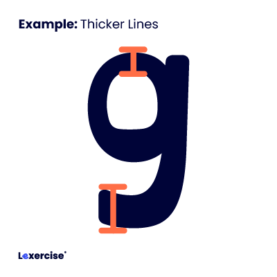
Thicker Lines: In dyslexia fonts, the bottom or specific parts of letters are often made heavier or thicker. The logic behind this is that by increasing the visual weight of certain areas, letters become “anchored”, making it less likely that someone would mistakenly perceive them as flipped or rotated.
-
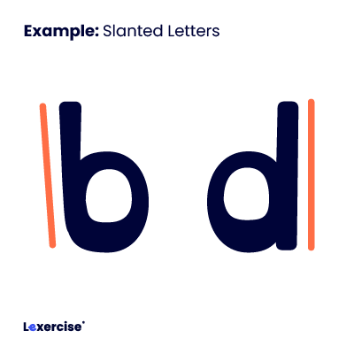
Slanted Letters: In fonts like Dyslexie, some letters are slanted to help differentiate them from other similar-looking characters, such as lowercase -b- and -d-. The claim is that this slight tilt makes each letter more distinguishable, reducing visual confusion.
-
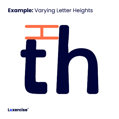
Varying Letter Heights: Letters with tails (descenders), such as -p- and -q-, and sticks (ascenders), such as -t- and -h-, are designed with tails and sticks of different heights to further distinguish them from each other. By elongating or shortening certain letters, the font creators hoped to prevent letter reversals.
Why Don’t These Adjustments Help Reading?
Despite the thoughtful reasoning behind these design decisions, research repeatedly finds that these font adjustments do not lead to measurable improvements in reading accuracy, comprehension, or speed for people with dyslexia. The underlying reason is that dyslexia is primarily a neurological issue related to processing language rather than a visual issue related to letter appearance.
Essentially, while dyslexia fonts might feel more comfortable or less visually taxing to some readers, they fail to directly target or remediate the underlying difficulties individuals with dyslexia face – particularly decoding words and understanding how letters represent sounds.
Thus, while dyslexia fonts are well-intentioned and can improve visual comfort for some readers, they do not effectively address the core difficulties associated with dyslexia.
Beyond Dyslexia Fonts: What Really Helps Improve Reading
Experts at Lexercise recommend using generally legible sans-serif fonts like Arial, Helvetica, Verdana, Tahoma, Century Gothic, and Calibri. These fonts are clear and well-spaced, benefiting all readers, including those with dyslexia. Factors like font size (12-14 points), adequate letter and word spacing, left alignment (not justified), and avoiding italics and underlining can also improve readability.
Dyslexia is a neurological condition that affects how the brain processes language, not just how it perceives letters on a page. As such, fonts, colored overlays, or even vision therapy do not address the core challenges of dyslexia. The brain’s literacy network supports and interconnects reading and writing. For example, learning to write each lowercase letter with a consistent and automatic movement pathway has been shown to improve letter and word recognition.
The most effective way to help individuals with dyslexia improve their reading skills is through a research-backed intervention that connects reading and writing, such as structured literacy with Lexercise. Unlike vision-based aids, structured literacy focuses on developing the fundamental skills required for reading, like phonemic awareness, letter formation, decoding, vocabulary, word parts, and spelling. This method has been proven in multiple studies to be the most effective for individuals with dyslexia, as it targets the brain’s ability to process, integrate, and understand written language.
If you’re looking for a real solution to dyslexia, focus on interventions that have been tested and proven through rigorous research, such as structured literacy. If your child struggles with reading, writing, or spelling it is important to take action as soon as possible. No matter where you live, your child can be tested and treated individually, face-to-face, online, by a qualified educational therapist at Lexercise. Learn more by contacting us at Info@Lexercise.com or 1-919-747-4557.
References
Galliussi, J., Perondi, L., Chia, G. et al. (2020). Inter-letter spacing, inter-word spacing, and font with dyslexia-friendly features: testing text readability in people with and without dyslexia. Ann. of Dyslexia https://pubmed.ncbi.nlm.nih.gov/32172467/
Gobir, N. (March 11, 2025) Handwriting Helps Kids Learn. Here’s How to Make the Most of It, KQED, MindShift https://www.kqed.org/mindshift/65286/handwriting-helps-kids-learn-heres-how-to-make-the-most-of-it
Kuster, S.M., van Weerdenburg, M., Gompel, M. et al. Dyslexie font does not benefit reading in children with or without dyslexia. Ann. of Dyslexia 68, 25–42 (2018). https://doi.org/10.1007/s11881-017-0154-6
Łuniewska, M., Wójcik, M., and Jednoróg, K. (2021). The effect of inter-letter spacing on reading performance and eye movements in typically reading and dyslexic children, Learning and Instruction, 101576 https://doi.org/10.1016/j.learninstruc.2021.101576. https://www.sciencedirect.com/science/article/pii/S0959475221001353
Pegado, F., Nakamura, K. and Hannagan, T. (2014). How does literacy break mirror invariance in the visual system? Frontiers in Psychology, Vol. 5: 703. https://www.frontiersin.org/journals/psychology/articles/10.3389/fpsyg.2014.00703/full
Wery, J.J., Diliberto, J.A. The effect of a specialized dyslexia font, OpenDyslexic, on reading rate and accuracy. Ann. of Dyslexia 67, 114–127 (2017). https://doi.org/10.1007/s11881-016-0127-1
Improve Your Child’s Reading
Learn more about Lexercise today.
Schedule a FREE
15-minute consultation